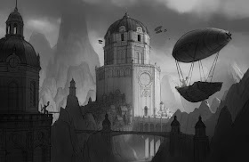
It's always a task coming down from the high energy of being in term, and I try to stay productive but I know eventually complacence will wash over me. Before that happens, I'm going to try and be as productive as possible. These are for the Creature Planet activity on CGHub. Final illustration is still in progress, but for some reason posting it lights a fire under my ass to push it further, so check back soon.
12/16/10
12/13/10
12/12/10
Character 1: Second Half
Felt like being a render monkey, and experimented with some photobashing on the creature. After about week 10-11, fifth term leveled out and became pretty easy. Instead of doing more work for classes or spending more time rendering what I had, I invested more time doing personal sketching and painting. Or watching movies. Definitely ready for sixth term.
12/1/10
Figure
Figure painting from Bob Kato's class trying to apply stuff learned with Acrylic painting into photoshop.
11/23/10
Drive inspired Speedy
Picked up Drive the other day- a book by Annis Naeem, Danny Gardner, and Scott Robertson. Very inspired by all the vehicles and couldn't help but pay homage to the superb "Salvage" section with a down-and-dirty doodle. After detaining the books for weeks, homeland security has finally confirmed the books aren't terrorist training manuals, so you will be able to pick up a copy soon- and I recommend you do.
Hopefully next term I'll get good enough at this stuff that your eyes stop bleeding. Until then, my apologies!
Hopefully next term I'll get good enough at this stuff that your eyes stop bleeding. Until then, my apologies!
EDIT: I got some good feedback from a friend in transportation design, so I tried to change things a bit to correct it:
11/3/10
More Architecture Homework
Not as happy with this one as the last: Something is wrong with my perspective on the main building... You just cant trust those damned 3d programs, can you? Maybe it's my sketching that needs work <_< And for those wondering, it's a very very large nod to Lindblum, probably one of my favorite cities in a video game ever.

10/24/10
Character Designs
Alright, this project was for Character Design 1 with Hong Ly and Kevin Chen, two of the most amazing teachers we've had so far at ACCD. Our classes are on Saturday from 9AM to 4PM, but it seems like it just never lasts long enough. The projects are fun, the crits are amazing, it's really great. Here was our first of two projects this term: A miyazaki movie in an animated stlye- anything from Dexter's Lab to Samurai Jack to Pixar or Dreamworks was our range, so for a large change of pace I attempted to do something 'Dreamworks' like. I'm not happy with the designs still, and the final poses I chose are extremely static, but I can't afford time in term to fix that stuff now, it's on to new projects! I'm going to post the development sketches as well so people have some insight on to how I arrived at the finals: As a final note- there were definitely good and bad sketching days, but I've decided not to edit the worse ones for the sake of transparency. Also, for the final renders there is no 3d used, only 2 or 3 photo-textures to add some insta-realism.
Theory
Characters are still being finished up... In the meantime, here's an exercise for Color Theory class!
Complimentary palette painting: you only use 2 hues, which are exact compliments, and try to make an image that doesn't look like it's only two hues.
This exercise has been far-far-far more educational than I ever would have thought and has really opened my eyes to alot of things. I highly recommend people to try it out. Here's how to make your palette to color pick from (Make sure to use very saturated colors for your base hues so you get the most range from your palette, something I forgot to do below:):
10/13/10
Architecture 1 homework
Fast value sketch underneath a line drawing from architecture class, the lines were done over a rough sketchup underlay. I apologize for the horrendous tangent that happened on the man's head. it's a doozy.
10/2/10
And another
going to try and fit in some personal work here and there this term, seems like a great way to let information sink in.
9/12/10
9/8/10
One does not simply rock in to Mordor..
Did a 'Mordor' painting for a challenge over at CGHub. Super cliche, but it was fun and good warm up for 5th term, starting in a few days :D
It's a bit dark but Mordor is a bit evil so you know... :P And beneath that is... well, it's just me getting my rocks off. Can you tell I like mountains?
It's a bit dark but Mordor is a bit evil so you know... :P And beneath that is... well, it's just me getting my rocks off. Can you tell I like mountains?
7/3/10
Clair De Lune
Another Red riding hood piece, not sure about the airship as far as the universe is concerned. Probably a bad idea- I dunno, we'll see!


